The NBL has unveiled all teams uniforms for the 2021/22 including the debut jerseys for the JackJumpers. Lets take a closer look.
Home
— NBL (@NBL) October 13, 2021
As expected, the JackJumpers will be playing with a predominantly dark green uniform for its home games in Hobart and Launceston. It features “JackJumpers” on the front, and yellow mandibles from their logo on the sides of the uniforms, the mandibles likely will be mistaken for lightning bolts by those without a knowledge of insect anatomy. This addition also looks very similar to the lightning bots the Golden State Warriors featured in their jerseys from the 1997-2003 seasons.
Overall this jersey is ok, but I am a little underwhelmed with the creativity, because they don’t look all that different to the training jerseys the players have been wearing in recent months. I understand the NBL place limitations on the jerseys, so they all conform to a similar standard, so they are limited somewhat in the overall design.
I would of liked some better use of the light green from their logo used, as its almost impossible to spot. Incorporating it in a subtle pattern on the dark green would of been nice touch (such as the indigenous pattern the wildcats have incorporated into their away jersey, or snake scales in the taipans away jersey). Whether the pattern was small jack jumper ants, a large outline of the JackJumper logo, map of Tasmania or incorporating the names of their “blood line” members is just a few ideas. 5/10
Away
— NBL (@NBL) October 13, 2021
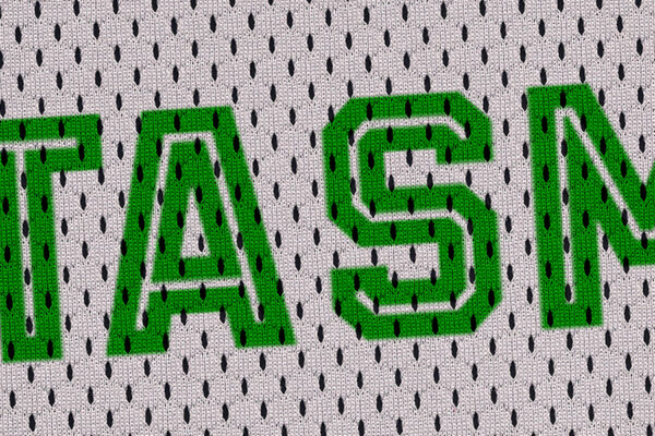
So the away jersey is white, as are the majority of NBL jerseys this season (New Zealand’s teal and Brisbane’s yellow being the only exceptions). It features “”Tasmania” on the front of the uniform, with the logo below and the yellow “mandibles” feature again on the sides,
This jersey is good, its quite simple but effective. Having the number and logo accent to the left (rather thaey remin in the centre) of “Tasmania” is a great move.
Again, some detail into the white jersey would of been a nice addition as other team have done, but it does avoid the jersey being “too busy”. 7/10
Overall
Both jersey are good, but the away jersey I think is the better of the two, but I am not sure if its just nice to see a fresh design from the green that we have seen through the majority of the merchandise and messaging from the team so far.
Again, the NBL and the Champion brand’s cookie cutter approach to all jersey’s having a similar template does limited teams on creativity, however we have seen other team make a few small tweaks that add a lot to their jerseys. I am much more interested to see what the JackJumpers bring to their limited edition jerseys later this season, we haven’t had confirmation yet on what the styles will be included for 21/22 but the last few seasons we have seen the city edition, indigenous and heritage (plus loony tunes as a one off in 2019/20). These traditionally give teams far more freedom in their designs and lead to some memorable or instantly forgettable jerseys.